THE GOAL
Create welcoming branding for a festival that unites neurodivergent and neurotypical individuals.
Create welcoming branding for a festival that unites neurodivergent and neurotypical individuals.
The Goal

Create welcoming branding for a festival that unites neurodivergent and neurotypical individuals.
Inclusion
Festival
The festival symbolizes a space where neurodivergent people can express themselves, share their stories, and feel welcomed, thus contributing to a more inclusive and understanding society.
By exploring how inclusive and accessible graphic design can assist those with mental health issues and raise public awareness, I have gained an in-depth understanding of this field. Elements such as bionic reading, readability, the psychological impact of colors on our mental health, and most importantly, empathy for our audience, are at the heart of this project. The goal is to adapt visual communication to be welcoming and comprehensible to all, considering the diverse needs of neurodivergent individuals.
Celebrating Neurodiversity and Ending the Stigma Around Mental Health Disorders!
As I reach the culmination of three years of studying digital design at École Estienne in Paris, I am excited to present my final graduation project.
In my journey, I have delved into how technology can assist individuals with mental health issues and raise awareness. I've gained a profound understanding of inclusive and accessible design. While tackling these significant topics has been challenging, initiating change and combating ableism is essential.
This project stems from a personal commitment to using my professional voice to address issues close to my heart: well-being, ending the stigma around mental disorders, and coping with our emotions. My own experiences with anxiety, OCD, and dyslexia—my "special spices," as I like to call them—fuel this mission. I am not ashamed because I know I am not alone.
Imagined to be organized by Région Île-de-France and held at La Villette in Paris, the festival's goal is to foster acceptance, understanding, and celebration of neurodiversity, paving the way for a more inclusive future.
Logo
The objective of this project was to renew the festival's visual identity to reflect its inclusive and dynamic vision, while creating attractive communication materials that captivated the audience and fostered engagement.
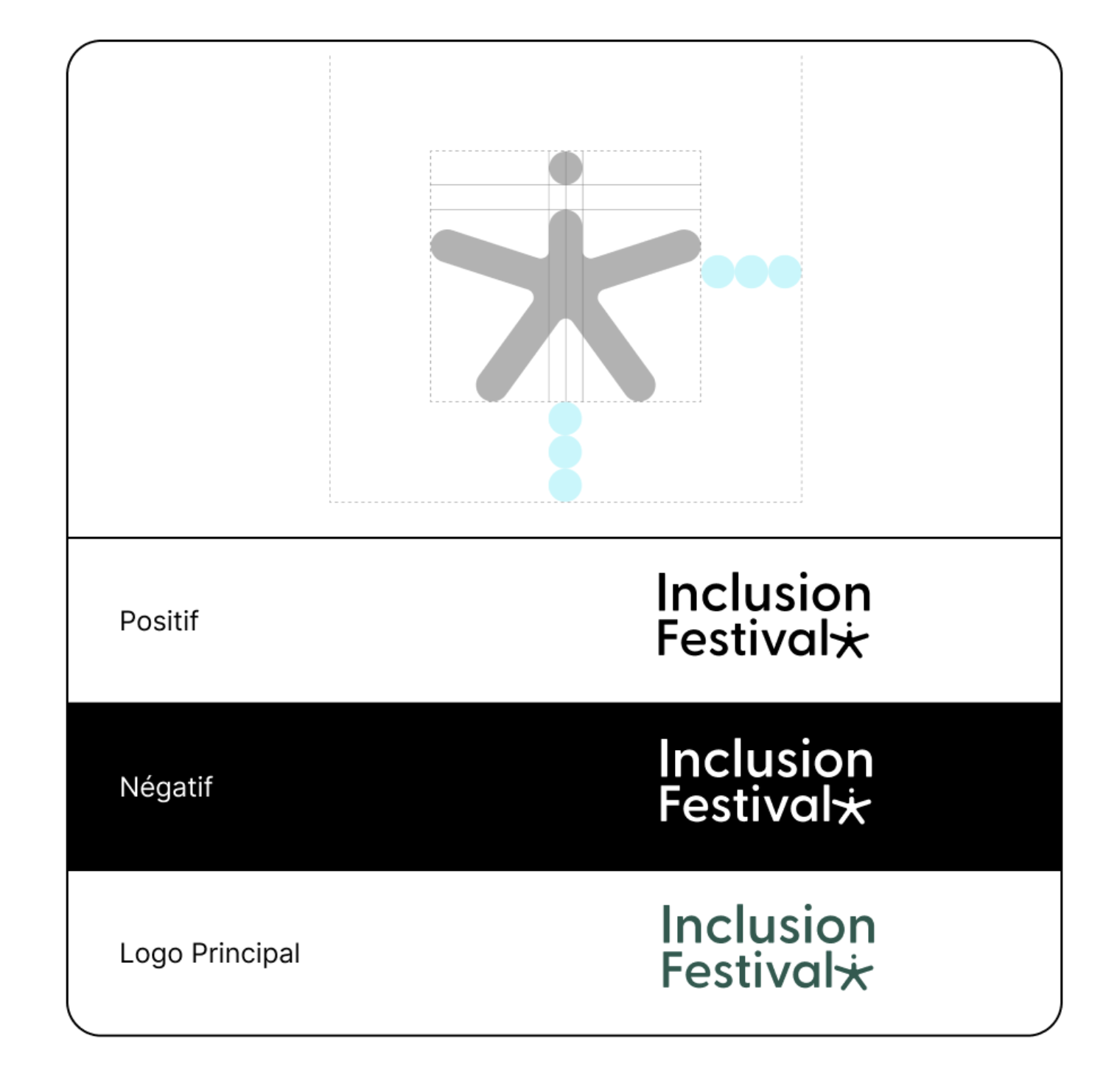
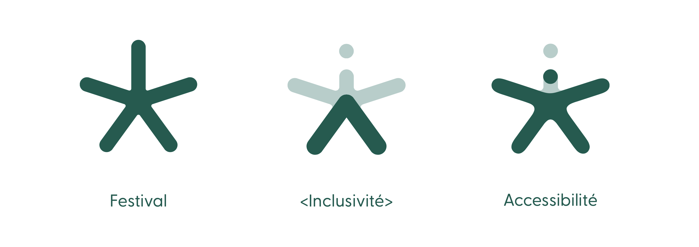
The logo is the most recognizable visual element of the brand. It should always be displayed in its original form.
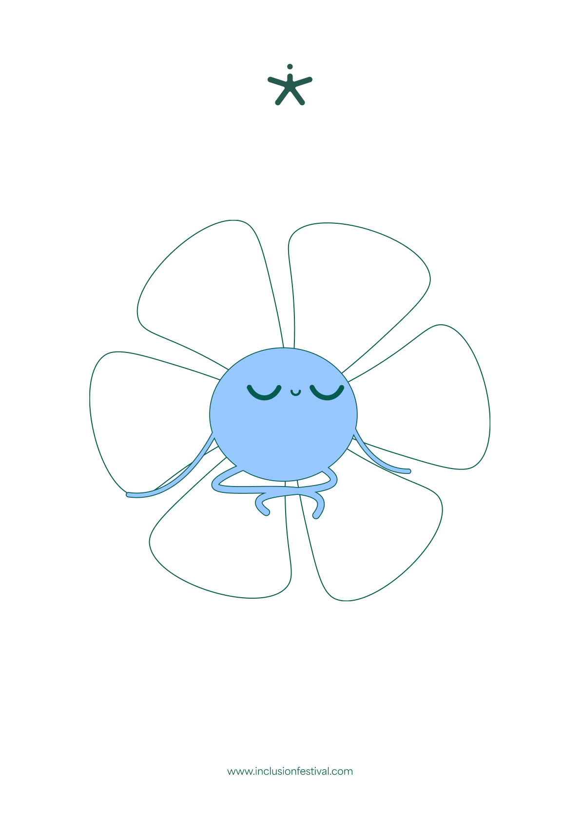
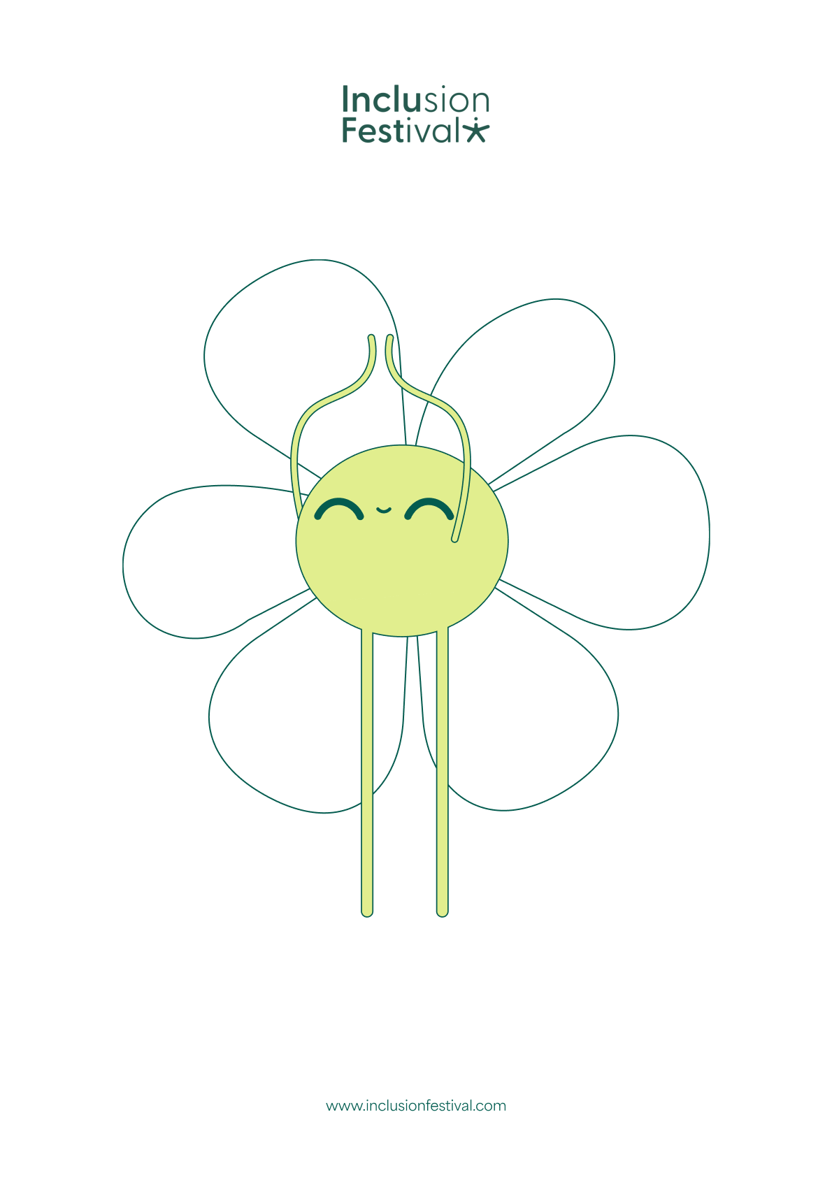
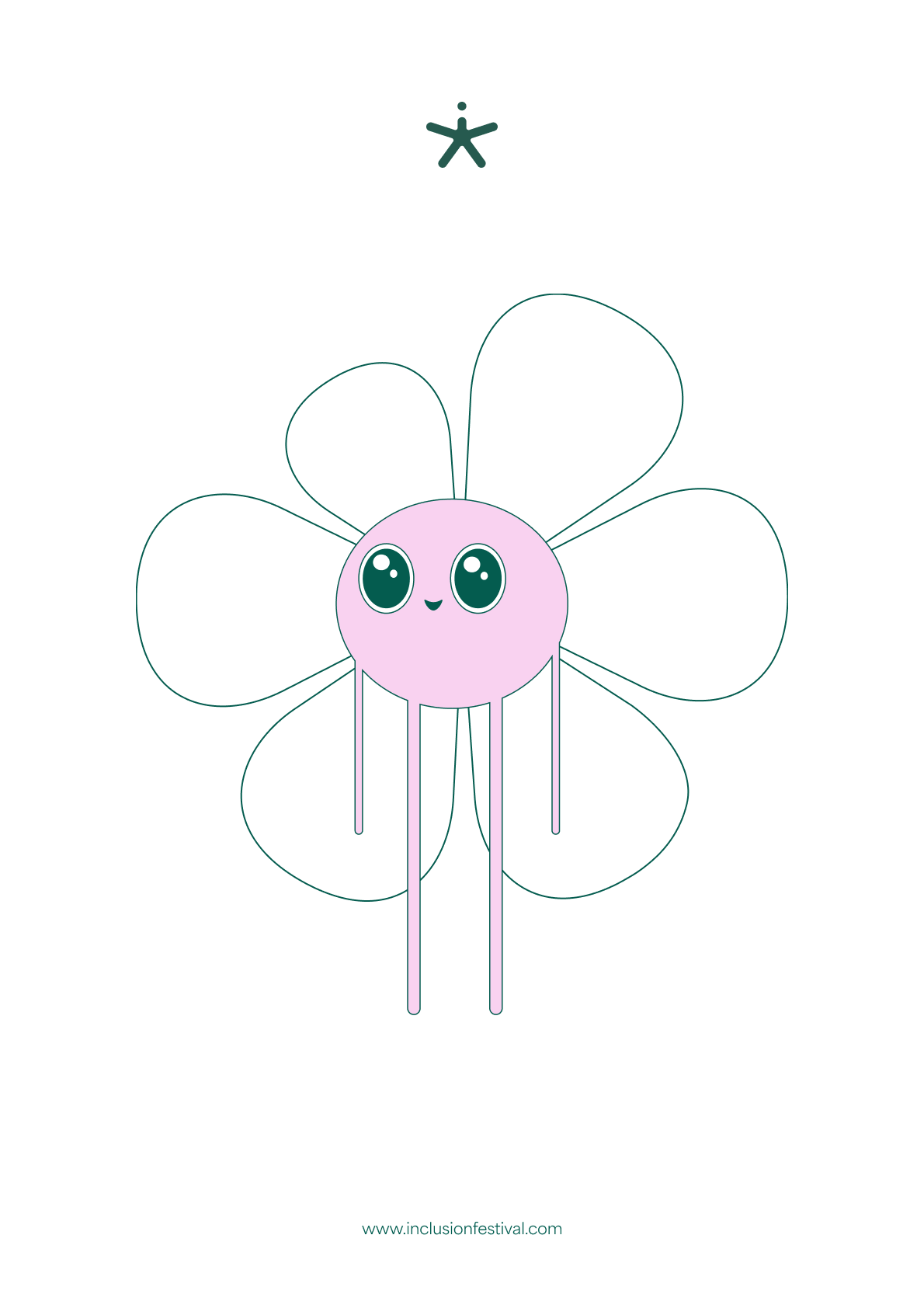
Therefore, I opted for a streamlined logo and emblem. It symbolizes festivity and energy, as well as inclusivity and accessibility of this event.
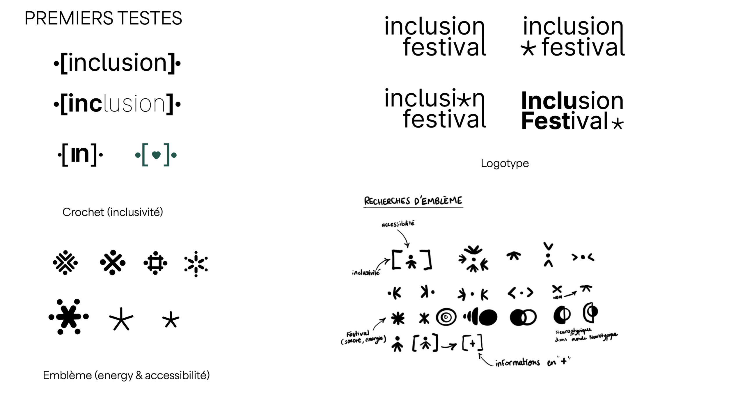

Research &
Color Theory
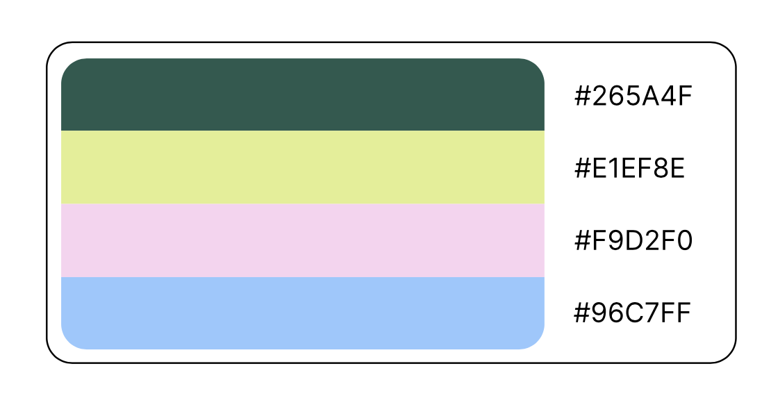
The Inclusion Festival adopts a color palette tailored to individuals living with neurodevelopmental disorders (such as autism spectrum disorder, which often involves sensitivity to overstimulation from colors and sounds).
Preferred Colors: Greens and blues
The impact of colors on our mental health is well-documented. Here are some examples:
Yellow reduces anxiety: Yellow is recognized as a warm and soothing color that can lower anxiety levels in individuals.
Green reduces stress: Spending time in green natural environments or even viewing green landscapes is associated with stress relief.
Blue generates feelings of tranquility and well-being: Blue induces calmer, pleasant, and relaxing emotions, promoting concentration, reflection, and meditation.
Red produces feelings of excitement: Red is linked to higher stress scores compared to green or white room conditions.
Why Bionic Reading?
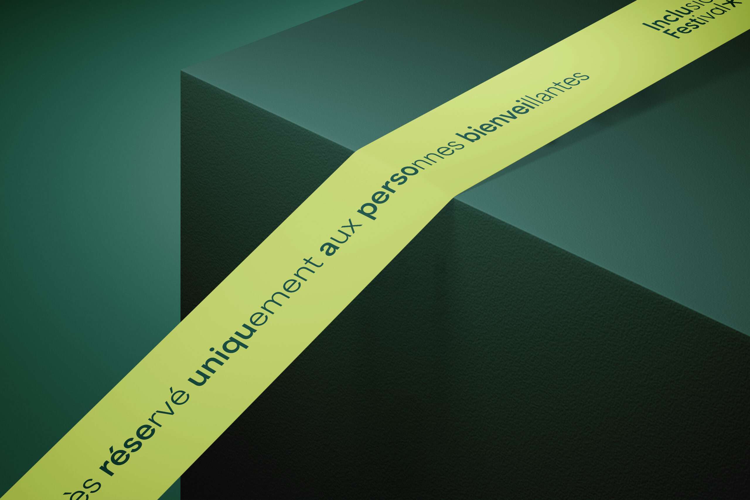
I used Greycliff and Area, which are linear sans-serif typographies, combined with the Bionic Reading method, makes our content accessible to people with reading and concentration difficulties, such as dyslexia and ADHD.
The typography is slightly rounded, giving it a soft and gentle appearance.
Visualising emphaty & love
Hey there, this is the default text for a new paragraph. Feel free to edit this paragraph by clicking on the yellow edit icon. After you are done just click on the yellow checkmark button on the top right. Have Fun!
Insta Story
Promoting artists, conferences, activities...
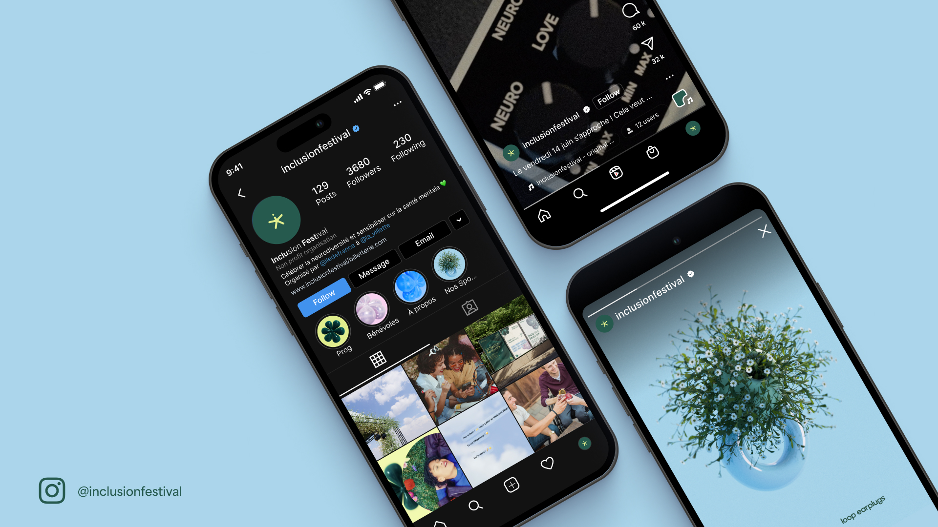
Teaser - Promoting through storytelling ...
Hey there, this is the default text for a new paragraph. Feel free to edit this paragraph by clicking on the yellow edit icon. After you are done just click on the yellow checkmark button on the top right. Have Fun!
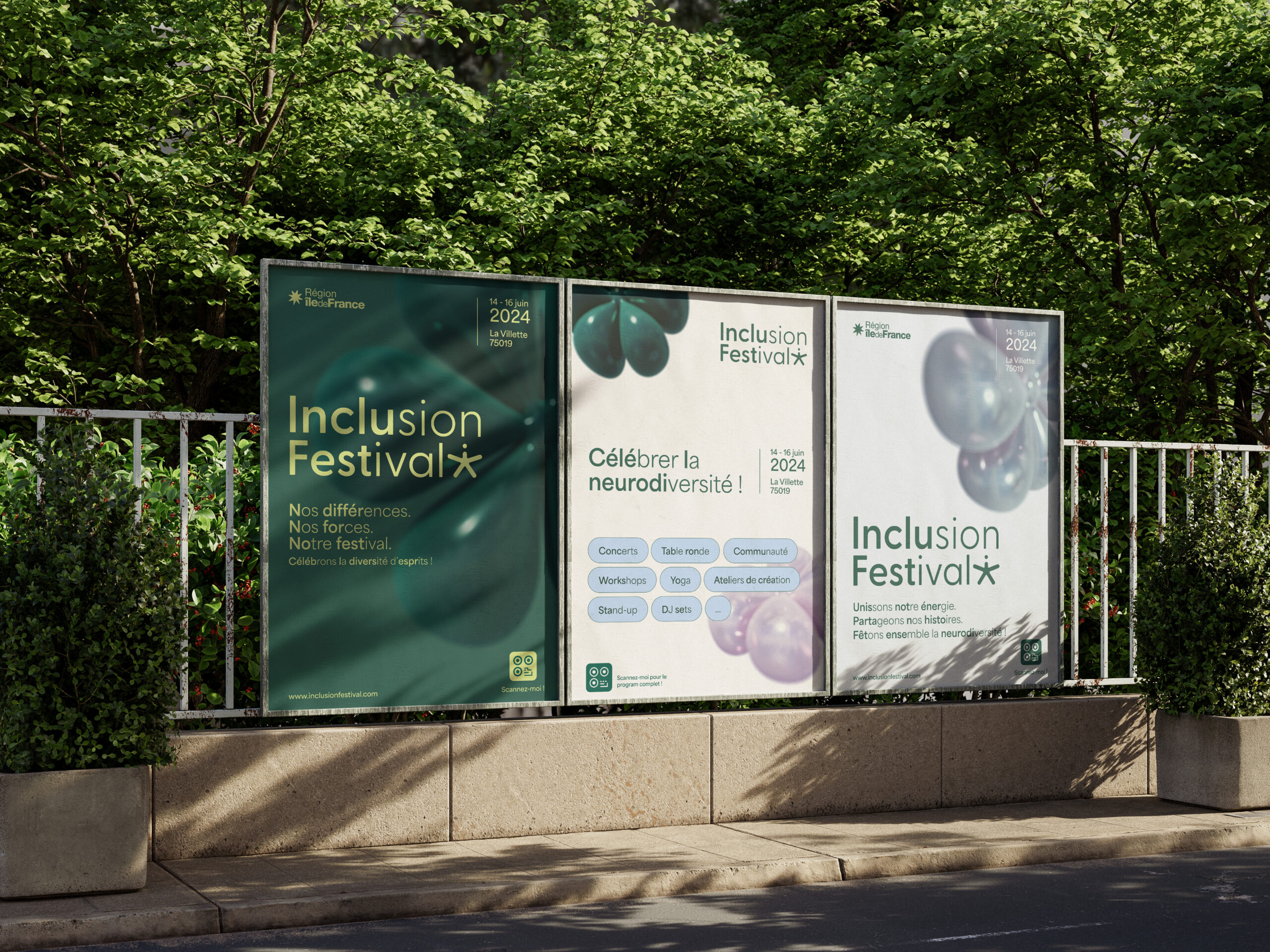
Posters
To create effective and engaging call-to-action posters, I needed tools designed for adaptability in design. This led me to the Figma plugin "Colorsinspo," which helps ensure color contrast compliance.
The Web Content Accessibility Guidelines (WCAG) are universally accepted standards that describe how to make online materials more accessible to people with disabilities.
Sponsor
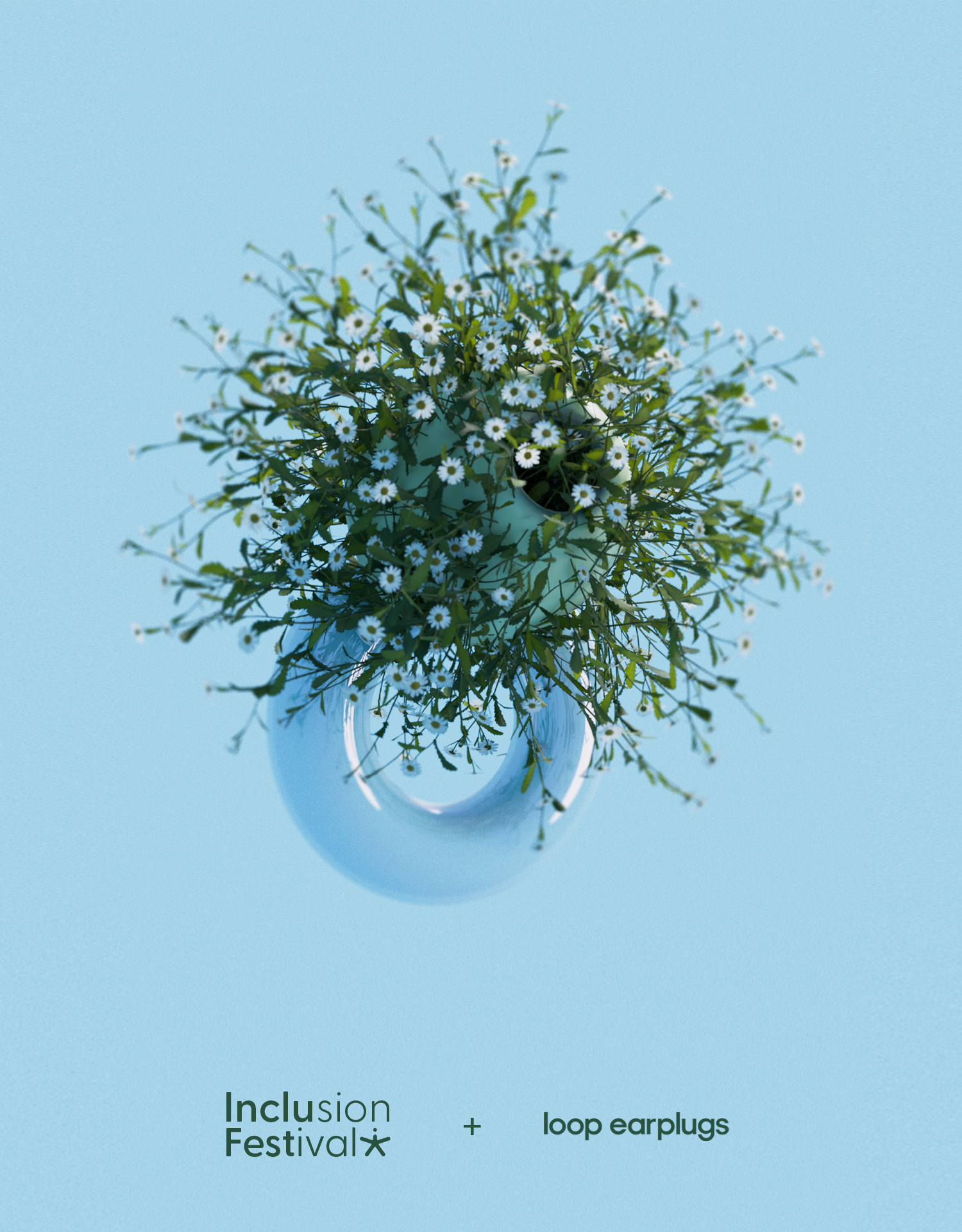
As a partner and sponsor of the festival, this represents a potential collaboration with Loop Earplugs, a rare gem in sensory-friendly solutions!
Illustrator
After Effects
Blender
Photoshop
Premiere Pro
Festival Branding
Mental Health Awarness
Accessibility & Diversity Branding
Let's get
in touch !
Biarritz, France
LinkedIn @EmmaBats
Instagram @emmaabats
All rights reserved © Emma Bats 2025


